Monochrome Vim Color Scheme
- vim, accessibility, design, projects
- 6
- finished
Rob Pike once said that syntax highlighting is juvenile. This is very bold statement and I wouldn’t go that far. In my opinion some typographical elements are necessary to break boredom of walls of texts, but it doesn’t have to be color, which has a natural tendency to quickly introduce unbearable noise. To prove that I have created bw.vim: a minimalistic monochrome color scheme.
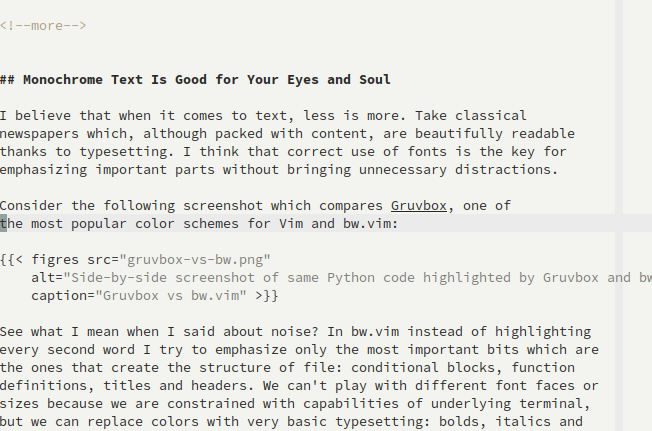
Monochrome Text Is Good for Your Eyes and Soul
I believe that when it comes to text, less is more. Take classical newspapers which, although packed with content, are beautifully readable thanks to typesetting. I think that correct use of fonts is the key for emphasizing important parts without bringing unnecessary distractions.
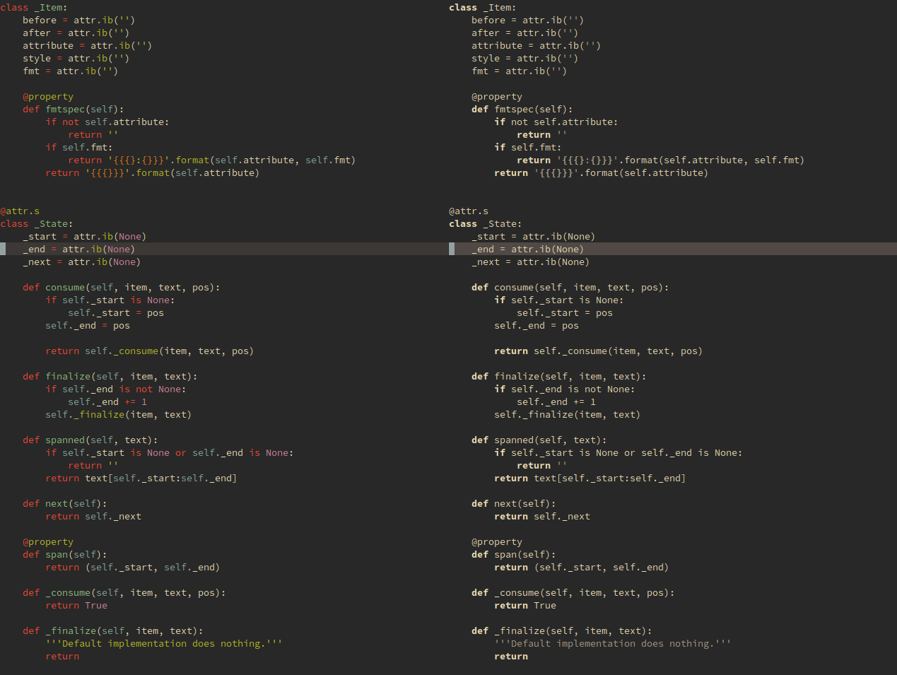
Consider the following screenshot which compares Gruvbox, one of the most popular color schemes for Vim and bw.vim:

Gruvbox vs bw.vim
See what I mean when I said about noise? In bw.vim instead of highlighting every second word I try to emphasize only the most important bits which are the ones that create the structure of file: conditional blocks, function definitions, titles and headers. We can’t play with different font faces or sizes because we are constrained with capabilities of underlying terminal, but we can replace colors with very basic typesetting: bolds, italics and underlines. It’s still a lot and I find it far better for meaningful deep work.
I’m pragmatic though. Colors have their use and can be a powerful tool when used sparingly. For example reds and greens, after decades of their presence, are now intrinsically ingrained in diffs. My notes have blue links because inter-connections between them are single most important feature of Zettelkasten-style notes, worth breaking the rules. Dirvish (a file browser) has colorful directories because it helps navigation; utilitarism wins.
Light Theme
Apparently light themes are more readable. People read dark fonts on light backrounds more accurately1 and specifically people with astigmatism (approx. 30-50% of population) find it harder to read otherwise2. After all, books have mastered black fonts on white background over centuries and we’re all used to them, even if they don’t emit light, in contrast to computer screens.
Recently, after many years of ignoring light themes, I have slowly started acknowledging their existence again. Today I find them superior especially in very bright rooms, at midday, in the middle of summer.
This is why bw.vim ships with both light and dark variants. It automatically
detects which one should be used by examining :help background.
Vim by itself reloads color scheme when background changes so I created a
simple function to toggle it during different times of a day3:
function! togglebg#togglebg()
    let &background = (&background == "dark" ? "light" : "dark")
endfunction

command! ToggleBg call togglebg#togglebg(<f-args>)
nnoremap <silent> <leader><leader>t :ToggleBg<cr>

Light variant of bw.vim
Extending bw.vim
Changing how bw.vim highlights different color groups is really easy, thanks
to hi function inherited from Fogbell. Have a look at an example:
call <sid>hi('asciidocURL', s:voidCream, s:none, 'underline')
With this the hard part remains figuring out names of color groups. I made it easier with the following mapping which reports names of color groups under the cursor:
map <F3> :echo "hi<" . synIDattr(synID(line("."),col("."),1),"name") . '> trans<'
\ . synIDattr(synID(line("."),col("."),0),"name") . "> lo<"
\ . synIDattr(synIDtrans(synID(line("."),col("."),1)),"name") . ">"<CR>

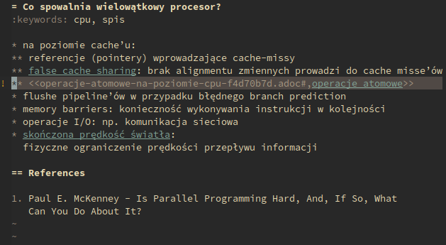
Note with highlighted links
Monochrome color schemes aren’t particularly novel idea. Before creating my own, I had checked at least half a dozen of other color schemes. My adaptation to no-color environment was practically painless and now I am thinking about switching my terminal, window manager and other programs to B&W. I don’t miss anything from color schemes that I used previously and the minimalism is refreshening. Try it yourself for a day or two, maybe you’ll like it as well!